How My Homezilla was designed to reduce UX friction

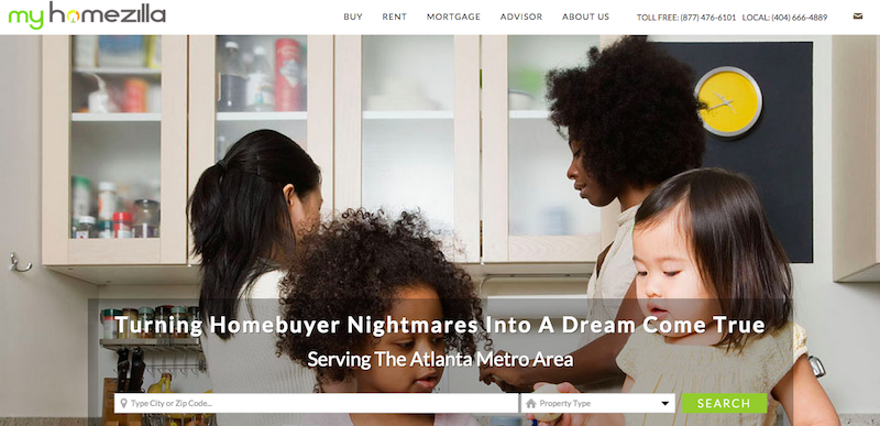
Hello again everyone! This week we have something really amazing to show you! It’s called MyHomezilla.com

This site was created at the request of Michael McGriff, a Real Estate Agent serving the Metro Atlanta, Georgia area. He called us one day to sign up for a Smart Site with us. He chose our Winning Agent Pro Smart Site, and he told us that he wanted some extra customizations that would help generate leads for him.
We were happy to hear the awesome ideas he had for his site, and off to work we went!
Animated Call-To-Action Buttons
One of the most fundamental keys to generating leads is to reduce what is called “User Experience Friction” or UX Friction. Basically, it means to make the user’s journey to where you want them to go as smooth as possible. When people know what they should do, they are going to experience less UX Friction and are more likely to do business with you.
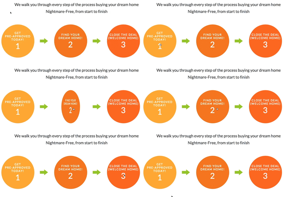
The three circles on the home page of MyHomezilla.com are a great example of making clear and attractive Call-To-Action buttons. Not only are they very well created, but they have numbers on them that makes the order of things easier to understand.

So now, each visitor knows that to find their dream home, they should get pre-approved (Circle 1), and search for their dream home! (Circle 2)
And that’s not even the best part!
We get asked the following question A LOT: “How do I generate leads for my site?”
Real Estate Agents sometimes struggle with the idea of using a more aggressive lead capture for their site that prohibits anyone from viewing listings unless they sign up for an account on their site. They feel that it is pushy, and they don’t like the idea of it.
We totally understand that!
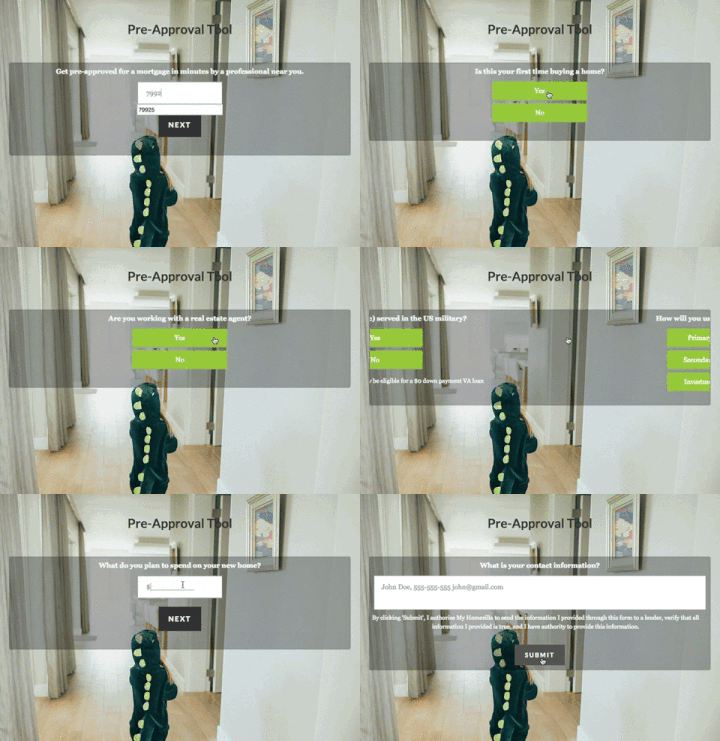
 That is why we feel that the Pre-Approval Tool we created for Michael’s site is such a game changer. It’s not just another form that people feel that they need to fill out, it’s an intelligent, interactive, entertaining way for visitors to Michael’s site to receive the assistance that they are looking for in a professional like himself.
This form saves the clients’ information at the end, not only generating a lead for Michael, but also marking the beginning of what could turn into a great business relationship!
We are really excited for Michael and for his new site, MyHomezilla.com. We are hoping that this will be a game-changer for his business by increasing the amount of business leads he receives!
[button class=”btn-info” size=”btn-hg” inline=”true” link=”https://realtycandy.com/portfolio” ]Check out our Portfolio![/button]
[button class=”btn-inverse” size=”btn-hg” inline=”true” link=”https://realtycandy.com/smartsite/” ]Check out our Smart Sites![/button]
[button class=”btn-inverse” size=”btn-hg” inline=”true” link=”http://myhomezilla.com/” ]Check out MyHomezilla.com![/button]